Snowflake MigrationClickHouse Workshops

Superset on Snowflake

Building the three source-side operational dashboards: connection, datasets, charts, and assembly.

This guide walks through creating all three dashboards in Apache Superset at http://localhost:8088 (admin / admin).

Order of operations:

  1. Start Superset and register the Snowflake connection
  2. Create all datasets (SQL queries saved as named datasets)
  3. Build charts and assemble dashboards

Step 1: Start Superset and Connect to Snowflake

Start Superset

The Superset image is customised to include the Snowflake and ClickHouse drivers. Use --build on first run so Docker builds it:

cd "$(git rev-parse --show-toplevel)/workshop_public/snowflake_migration_lab/01-setup-snowflake/superset"
source ../.env
docker compose up -d --build

Register the database connection (automated)

From the superset/ directory, run:

source ../.env && ./init_superset.sh

The script waits for Superset to be ready, then registers NYC Taxi — Snowflake (Source) automatically. Expected output:

>>> Superset is up.
>>> Authenticated.
>>> CSRF token obtained.
>>> Registering: NYC Taxi — Snowflake (Source)
    Registered successfully.

Register the database connection (manual alternative)

If you prefer to register through the UI:

  1. Go to Settings → Database Connections → + Database
  2. Select Snowflake
  3. Fill in the SQLAlchemy URI — URL-encode any special characters in your password (#%23, !%21, @%40, etc.):
snowflake://<USER>:<URL_ENCODED_PASSWORD>@<SNOWFLAKE_ORG>-<SNOWFLAKE_ACCOUNT>/NYC_TAXI_DB/ANALYTICS?warehouse=ANALYTICS_WH&role=ANALYST_ROLE
  1. Set Display Name: NYC Taxi — Snowflake (Source)
  2. Under Advanced → SQL Lab: enable Allow this database to be explored and Allow DML
  3. Click Test Connection → should show "Connection looks good!"
  4. Click Connect

Step 2: Create All Datasets

All charts use virtual datasets — SQL queries saved as named datasets.

How to create each dataset:

  1. Go to Datasets → + Dataset
  2. Select database: NYC Taxi — Snowflake (Source)
  3. Click Create dataset from SQL query and paste the SQL below
  4. Save with the name shown
  5. After saving: go to Datasets → pencil icon → Columns tab → "Sync columns from source" → Save. Without this step the chart builder will show 0 columns.

Dashboard 1 Datasets

ops_hourly_revenue — Hourly revenue by borough

Schema: ANALYTICS

SELECT
    DATE_TRUNC('hour', pickup_at)                      AS hour_bucket,
    pickup_borough,
    COUNT(*)                                           AS trip_count,
    SUM(total_amount_usd)                              AS total_revenue,
    AVG(tip_amount_usd / NULLIF(fare_amount_usd, 0))  AS avg_tip_rate,
    AVG(trip_distance_miles)                           AS avg_distance_miles
FROM ANALYTICS.FACT_TRIPS
WHERE pickup_at >= DATEADD('day', -7, CURRENT_TIMESTAMP())
  AND pickup_borough IS NOT NULL
GROUP BY 1, 2
ORDER BY 1 DESC, total_revenue DESC

ops_zone_agg — Zone aggregates

Schema: ANALYTICS

SELECT
    hour_bucket,
    zone_id,
    trips,
    revenue,
    avg_distance
FROM ANALYTICS.AGG_HOURLY_ZONE_TRIPS
WHERE hour_bucket >= DATEADD('day', -7, CURRENT_TIMESTAMP())

ops_payment_split — Payment type split

Schema: ANALYTICS

SELECT
    payment_type,
    COUNT(*)              AS trip_count,
    SUM(total_amount_usd) AS total_revenue
FROM ANALYTICS.FACT_TRIPS
WHERE pickup_at >= DATEADD('day', -7, CURRENT_TIMESTAMP())
GROUP BY 1

Dashboard 2 Datasets

exec_rolling_avg — Rolling 7-day averages

Schema: ANALYTICS

SELECT
    pickup_at::DATE                                          AS trip_date,
    COUNT(*)                                                 AS daily_trip_count,
    AVG(trip_distance_miles)                                 AS daily_avg_distance,
    AVG(AVG(trip_distance_miles)) OVER (
        ORDER BY pickup_at::DATE
        ROWS BETWEEN 6 PRECEDING AND CURRENT ROW
    )                                                        AS rolling_7d_avg_distance,
    SUM(total_amount_usd)                                    AS daily_revenue,
    SUM(SUM(total_amount_usd)) OVER (
        ORDER BY pickup_at::DATE
        ROWS BETWEEN 6 PRECEDING AND CURRENT ROW
    )                                                        AS rolling_7d_revenue
FROM ANALYTICS.FACT_TRIPS
GROUP BY 1
ORDER BY 1 DESC
LIMIT 365

exec_top_trips — Top 10 highest-value trips per borough

Schema: ANALYTICS

Uses Snowflake's QUALIFY — a key migration challenge. The ClickHouse rewrite requires a subquery.

SELECT
    trip_id,
    pickup_at,
    pickup_borough,
    total_amount_usd,
    tip_amount_usd,
    trip_distance_miles,
    ROW_NUMBER() OVER (
        PARTITION BY pickup_borough
        ORDER BY total_amount_usd DESC
    ) AS rank_in_borough
FROM ANALYTICS.FACT_TRIPS
WHERE pickup_at::DATE = CURRENT_DATE() - 1
QUALIFY rank_in_borough <= 10
ORDER BY pickup_borough, rank_in_borough

exec_surge — Surge pricing impact

Schema: ANALYTICS

SELECT
    CASE
        WHEN surge_multiplier >= 2.0 THEN 'High Surge (2x+)'
        WHEN surge_multiplier >= 1.5 THEN 'Medium Surge (1.5–2x)'
        WHEN surge_multiplier > 1.0  THEN 'Low Surge (1–1.5x)'
        ELSE 'No Surge (1x)'
    END                                    AS surge_category,
    COUNT(*)                               AS trip_count,
    ROUND(AVG(total_amount_usd), 2)        AS avg_total_fare,
    ROUND(AVG(fare_amount_usd), 2)         AS avg_base_fare,
    ROUND(AVG(surge_multiplier), 2)        AS avg_surge
FROM ANALYTICS.FACT_TRIPS
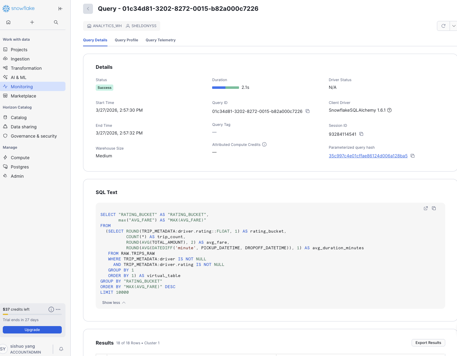
WHERE surge_multiplier IS NOT NULL
GROUP BY 1
ORDER BY avg_surge DESC

Dashboard 3 Datasets

dqa_rating_dist — Driver rating distribution

Schema: RAW ← change this when creating the dataset

Queries RAW.TRIPS_RAW directly via VARIANT colon-path syntax. This is the intentionally slow query — the ClickHouse benchmark target.

SELECT
    ROUND(TRIP_METADATA:driver.rating::FLOAT, 1)                           AS rating_bucket,
    COUNT(*)                                                               AS trip_count,
    ROUND(AVG(TOTAL_AMOUNT), 2)                                            AS avg_fare,
    ROUND(AVG(DATEDIFF('minute', PICKUP_DATETIME, DROPOFF_DATETIME)), 1)   AS avg_duration_minutes
FROM RAW.TRIPS_RAW
WHERE TRIP_METADATA:driver IS NOT NULL
  AND TRIP_METADATA:driver.rating IS NOT NULL
GROUP BY 1
ORDER BY 1

dqa_vehicle — Vehicle type revenue

Schema: ANALYTICS

SELECT
    vehicle_type,
    COUNT(*)                 AS trip_count,
    SUM(total_amount_usd)    AS total_revenue,
    AVG(total_amount_usd)    AS avg_fare,
    AVG(trip_distance_miles) AS avg_distance
FROM ANALYTICS.FACT_TRIPS
WHERE vehicle_type IS NOT NULL
GROUP BY 1
ORDER BY total_revenue DESC

dqa_traffic — Traffic level vs trip duration

Schema: ANALYTICS

SELECT
    traffic_level,
    COUNT(*)                   AS trip_count,
    AVG(duration_minutes)      AS avg_duration_minutes,
    AVG(trip_distance_miles)   AS avg_distance_miles,
    AVG(total_amount_usd)      AS avg_fare
FROM ANALYTICS.FACT_TRIPS
WHERE traffic_level IS NOT NULL
GROUP BY 1
ORDER BY avg_duration_minutes DESC

Schema: ANALYTICS

SELECT
    pickup_at::DATE       AS trip_date,
    app_platform,
    COUNT(*)              AS trip_count,
    AVG(surge_multiplier) AS avg_surge
FROM ANALYTICS.FACT_TRIPS
WHERE app_platform IS NOT NULL
  AND pickup_at >= DATEADD('day', -30, CURRENT_TIMESTAMP())
GROUP BY 1, 2
ORDER BY 1 DESC

Step 3: Build Dashboards

All 10 datasets are now ready. Create charts and add them to dashboards.


Dashboard 1: Operations Command Center

Purpose: Real-time operational view showing the last 7 days. This is the first dashboard partners repoint to ClickHouse in Part 2.

Create the dashboard:

  1. Dashboards → + Dashboard
  2. Title: Operations Command Center
  3. Auto-refresh: every 15 minutes (··· → Edit dashboard → Auto-refresh)

Chart 1: Trips per Hour (Line chart)

  • Chart type: Line Chart
  • Dataset: ops_hourly_revenue
  • X-axis: hour_bucket
  • Metrics: SUM(trip_count)
  • Series: pickup_borough
  • Title: Trips per Hour — Last 7 Days

Chart 2: Revenue by Borough (Bar chart)

  • Chart type: Bar Chart
  • Dataset: ops_hourly_revenue
  • X-axis: pickup_borough
  • Metrics: SUM(total_revenue)
  • Sort: descending by metric
  • Title: Total Revenue by Borough — Last 7 Days

Chart 3: Payment Type Split (Pie chart)

  • Chart type: Pie Chart
  • Dataset: ops_payment_split
  • Dimension: payment_type
  • Metric: SUM(trip_count)
  • Show labels: on
  • Title: Trip Count by Payment Type

Chart 4: Total Trips (Big Number)

  • Chart type: Big Number with Trendline
  • Dataset: ops_hourly_revenue
  • Metric: SUM(trip_count)
  • Title: Total Trips (Last 7 Days)

Chart 5: Borough Performance Summary (Table)

  • Chart type: Table
  • Dataset: ops_hourly_revenue
  • Columns: pickup_borough, SUM(trip_count), SUM(total_revenue), AVG(avg_tip_rate)
  • Row limit: 10
  • Sort: SUM(total_revenue) descending
  • Title: Borough Performance Summary

Layout:

[ Total Trips — Big Number ]  [ Total Revenue — Big Number (add 2nd)  ]
[ Trips per Hour — Line chart (full width)                            ]
[ Revenue by Borough — Bar ]  [ Payment Type Split — Pie             ]
[ Borough Performance — Table (full width)                            ]

Dashboard 2: Executive Weekly Report

Purpose: Strategic view for weekly business review. Showcases window functions and Snowflake-specific syntax (QUALIFY) that require rewrites in ClickHouse.

Create the dashboard:

  1. Dashboards → + Dashboard
  2. Title: Executive Weekly Report
  3. Auto-refresh: 1 hour

Chart 6: Rolling 7-Day Revenue Trend (Line chart)

  • Chart type: Line Chart
  • Dataset: exec_rolling_avg
  • X-axis: trip_date
  • Metrics: MAX(daily_revenue), MAX(rolling_7d_revenue)
  • Title: Daily Revenue with 7-Day Rolling Average

Chart 7a: Daily Trip Volume (Big Number)

  • Chart type: Big Number with Trendline
  • Dataset: exec_rolling_avg
  • Metric: MAX(daily_trip_count)
  • Title: Daily Trip Volume (Last Year)

Chart 7b: Rolling 7-Day Average Distance (Line chart)

  • Chart type: Line Chart
  • Dataset: exec_rolling_avg
  • X-axis: trip_date
  • Metrics: MAX(rolling_7d_avg_distance)
  • Title: Rolling 7-Day Average Distance (miles)

Chart 8: Top 10 Trips per Borough (Table)

  • Chart type: Table
  • Dataset: exec_top_trips
  • Query Mode: RAW RECORDS ← important: the dataset uses QUALIFY so Superset must not re-aggregate
  • Columns: pickup_borough, rank_in_borough, total_amount_usd, tip_amount_usd, trip_distance_miles, pickup_at
  • Sort By: total_amount_usd descending
  • Row limit: 60
  • Title: Top 10 Trips per Borough — Yesterday
  • Note: Uses QUALIFY — Snowflake-specific, must be rewritten as a subquery for ClickHouse

Chart 9: Surge Pricing Breakdown (Mixed chart)

  • Chart type: Mixed Chart ← use this, not Bar Chart; Bar Chart has no secondary axis support
  • Dataset: exec_surge
  • X-axis: surge_category
  • Query A — Bar: metric SUM(trip_count), label Trip Count
  • Query B — Line: metric MAX(avg_total_fare), label Avg Total Fare, Y-axis: Right
  • Sort: SUM(trip_count) descending
  • Title: Trip Volume and Average Fare by Surge Category

Chart 10: Surge Distribution (Pie chart)

  • Chart type: Pie Chart
  • Dataset: exec_surge
  • Dimension: surge_category
  • Metric: SUM(trip_count)
  • Title: Surge Pricing Distribution

Layout:

[ Rolling Revenue — Line chart (full width)                              ]
[ Daily Trip Volume — Big Number (50%) ]  [ Avg Distance — Line (50%)   ]
[ Top 10 Trips — Table (60%) ]  [ Surge Distribution — Pie (40%)        ]
[ Surge Breakdown — Bar chart (full width)                               ]

Dashboard 3: Driver & Quality Analytics

Purpose: Deep-dive on driver performance and trip quality. Intentionally the slowest dashboard — queries RAW.TRIPS_RAW directly via VARIANT access. Record the query time here as the baseline for the ClickHouse performance benchmark in Part 2.

Create the dashboard:

  1. Dashboards → + Dashboard
  2. Title: Driver & Quality Analytics
  3. Auto-refresh: 1 hour

Chart 11: Trip Count by Driver Rating (Bar chart)

  • Chart type: Bar Chart
  • Dataset: dqa_rating_dist
  • X-axis: rating_bucket
  • Metrics: SUM(trip_count)
  • Title: Trip Count by Driver Rating
  • Note: Scans RAW.TRIPS_RAW with VARIANT access — observe query time vs ClickHouse

Chart 12: Average Fare by Rating (Line chart)

  • Chart type: Line Chart
  • Dataset: dqa_rating_dist
  • X-axis: rating_bucket
  • Metrics: MAX(avg_fare)
  • Title: Average Fare by Driver Rating

Chart 13: Revenue by Vehicle Type (Horizontal bar)

  • Chart type: Bar Chart (horizontal)
  • Dataset: dqa_vehicle
  • X-axis: vehicle_type
  • Metrics: SUM(total_revenue), SUM(trip_count) (secondary axis)
  • Title: Revenue and Trip Count by Vehicle Type

Chart 14: Traffic Level Impact (Bar chart)

  • Chart type: Bar Chart
  • Dataset: dqa_traffic
  • X-axis: traffic_level
  • Metrics: MAX(avg_duration_minutes), MAX(avg_distance_miles) (secondary axis)
  • Title: Average Trip Duration and Distance by Traffic Level

Chart 15: Daily Trips by App Platform (Line chart)

  • Chart type: Line Chart
  • Dataset: dqa_platform
  • X-axis: trip_date
  • Metrics: SUM(trip_count)
  • Series: app_platform
  • Title: Daily Trips by App Platform — Last 30 Days

Chart 16: Surge by Platform (Table)

  • Chart type: Table
  • Dataset: dqa_platform
  • Columns: app_platform, SUM(trip_count), AVG(avg_surge)
  • Row limit: 10
  • Title: Surge by Platform

Layout:

[ Trip Count by Rating — Bar ]  [ Avg Fare by Rating — Line            ]
[ Revenue by Vehicle Type — Horizontal bar (full width)                ]
[ Traffic Level Impact — Bar (50%) ]  [ Surge by Platform — Table (50%)]
[ Daily Trips by Platform — Line chart (full width)                    ]

Step 4: Verify

  1. Open each dashboard and confirm all charts load without errors
  2. For Dashboard 3, note the dqa_rating_dist query execution time in Snowflake UI → Activity → Query History — save this as your migration benchmark

Superset chart showing driver rating distribution across the Snowflake dataset, concentrated between 4.0 and 5.0

Step 5: Export for Reuse

Once dashboards are complete, export them so future runs can auto-import:

  1. Open each dashboard → ···Export (saves as .zip)
  2. Place the files in superset/dashboards/:
    • 01_operations_command_center.zip
    • 02_executive_weekly_report.zip
    • 03_driver_quality_analytics.zip
  3. Re-run ./init_superset.sh — it will import them automatically on future setups

Important — placeholder credentials in committed ZIPs.

Each committed *.zip has its database connection redacted in databases/*.yaml:

sqlalchemy_uri: snowflake://LAB_USER:XXXXXXXXXX@MYORG-MYACCOUNT/NYC_TAXI_DB/ANALYTICS?role=ANALYST_ROLE&warehouse=ANALYTICS_WH
  • Auto-import (./init_superset.sh) — works as-is. The script registers the real Snowflake connection from .env before importing, then re-applies the correct URI after each import (see _update_db in init_superset.sh), so the placeholder values are overwritten with your real credentials.
  • Manual import via Superset UI — the imported database will be created with the placeholder URI and won't connect. After import, go to Settings → Database Connections → Edit the entry and replace sqlalchemy_uri with your real Snowflake URI (e.g. snowflake://<USER>:<PASSWORD>@<ORG>-<ACCOUNT>/NYC_TAXI_DB/ANALYTICS?role=ANALYST_ROLE&warehouse=ANALYTICS_WH).
  • Re-exporting your own dashboards — Superset bakes your account locator and username into databases/*.yaml on export. Before committing your re-exported ZIPs, redact those values back to MYORG-MYACCOUNT / LAB_USER so your account identifiers don't leak into git history.
On this page

Step 1: Start Superset and Connect to SnowflakeStart SupersetRegister the database connection (automated)Register the database connection (manual alternative)Step 2: Create All DatasetsDashboard 1 Datasetsops_hourly_revenue — Hourly revenue by boroughops_zone_agg — Zone aggregatesops_payment_split — Payment type splitDashboard 2 Datasetsexec_rolling_avg — Rolling 7-day averagesexec_top_trips — Top 10 highest-value trips per boroughexec_surge — Surge pricing impactDashboard 3 Datasetsdqa_rating_dist — Driver rating distributiondqa_vehicle — Vehicle type revenuedqa_traffic — Traffic level vs trip durationdqa_platform — App platform trendsStep 3: Build DashboardsDashboard 1: Operations Command CenterChart 1: Trips per Hour (Line chart)Chart 2: Revenue by Borough (Bar chart)Chart 3: Payment Type Split (Pie chart)Chart 4: Total Trips (Big Number)Chart 5: Borough Performance Summary (Table)Dashboard 2: Executive Weekly ReportChart 6: Rolling 7-Day Revenue Trend (Line chart)Chart 7a: Daily Trip Volume (Big Number)Chart 7b: Rolling 7-Day Average Distance (Line chart)Chart 8: Top 10 Trips per Borough (Table)Chart 9: Surge Pricing Breakdown (Mixed chart)Chart 10: Surge Distribution (Pie chart)Dashboard 3: Driver & Quality AnalyticsChart 11: Trip Count by Driver Rating (Bar chart)Chart 12: Average Fare by Rating (Line chart)Chart 13: Revenue by Vehicle Type (Horizontal bar)Chart 14: Traffic Level Impact (Bar chart)Chart 15: Daily Trips by App Platform (Line chart)Chart 16: Surge by Platform (Table)Step 4: VerifyStep 5: Export for Reuse